Balloon Museum
Level 1: Brand Leader
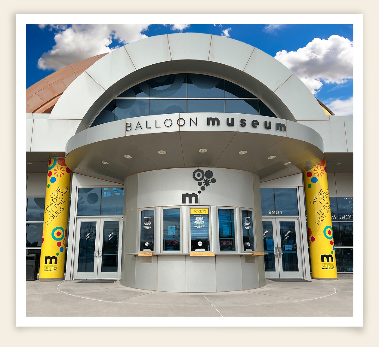
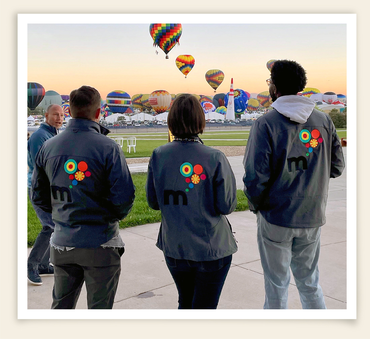
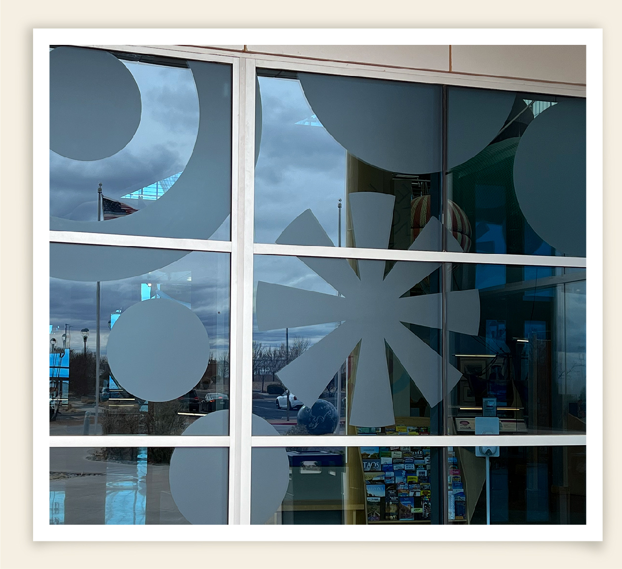
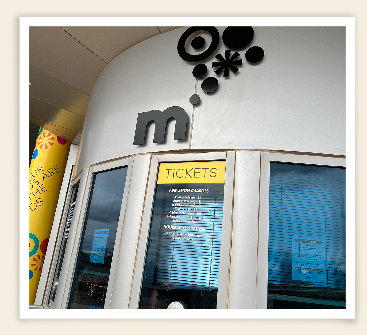
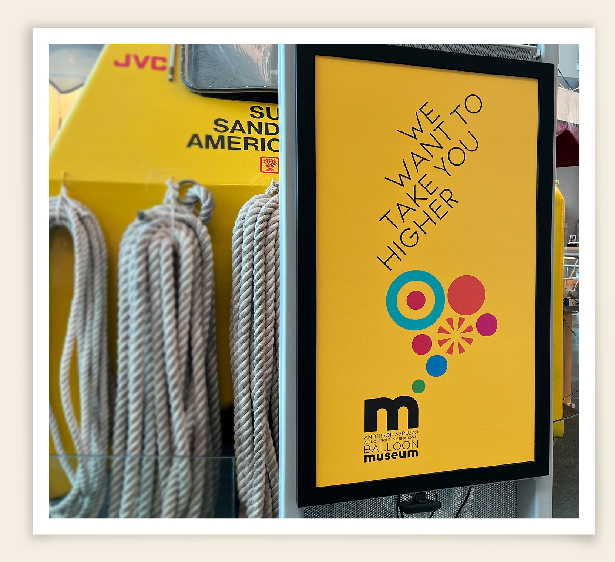
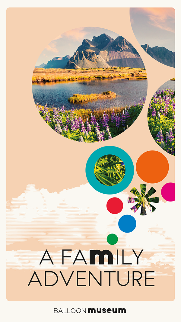
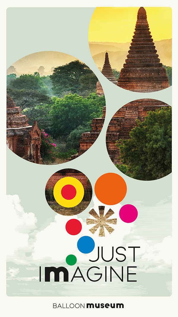
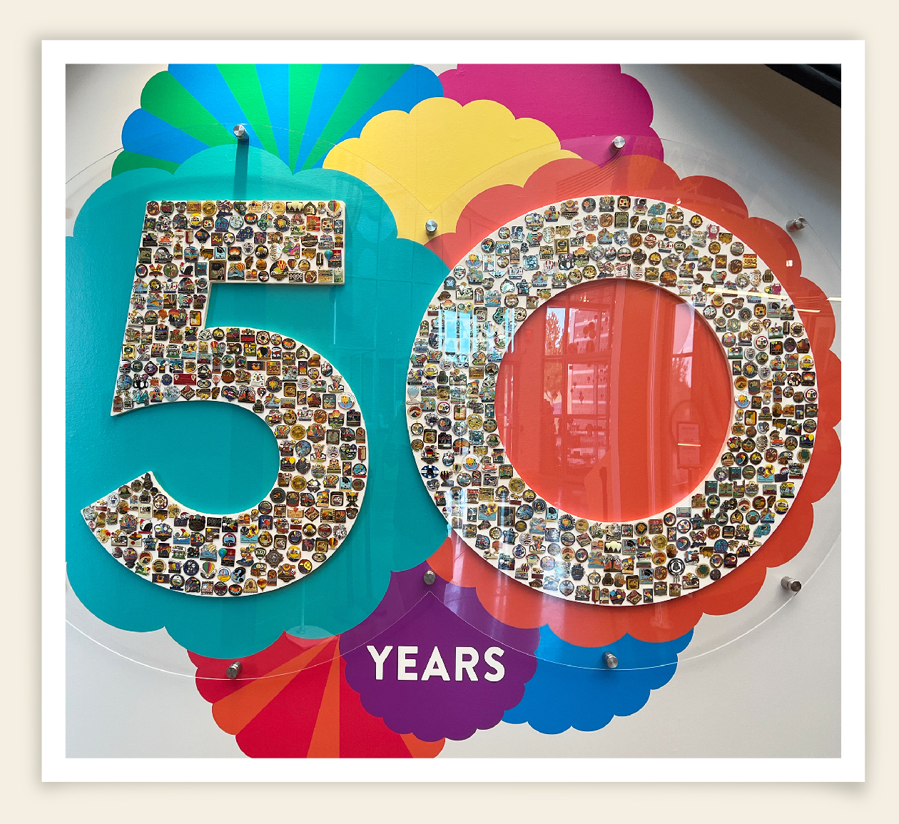
The Albuquerque International Balloon Museum offers an immersive experience of fun, adventure, and dreams. In order to convey the excitement of ballooning and the historical significance of their work, they required a branding system that spoke to both aspects. The new logo literally says "we're a museum that thinks in balloons". The branding system integrates modern, eye-catching colors and messaging for high-impact promotions, while utilizing more subtle vintage colors for certain marketing communications to convey a sense of history. The outcome is a modular system of messaging, image, and graphic libraries, as well as templates that provide an unlimited resource for the museum.
THE BRAND STORY
LIGHTER THAN AIR
Just imagine. To be free of the bounds of the earth. Untethered and floating amongst the birds, touching the clouds. The only sounds those of the wind and the occasional gentle breath of the burner. You are at the will of the winds…the beck and call of the breezes…free to go wherever they might take you. Past the Sandias surely. But why stop there? Why not along the Pyrenees, through the Alps, over Mount Kilimanjaro. Around the world in 80 days perhaps. Someday, even the craters of the moon. What extraordinary adventures and breathtaking journeys await future aeronauts. The only limitations are of the mind and spirit. So, open both of yours and ask yourself where you would like to go. Anywhere at all. Then take your first step here. Buen viaje.
UPLIFTING BRAND MESSAGING
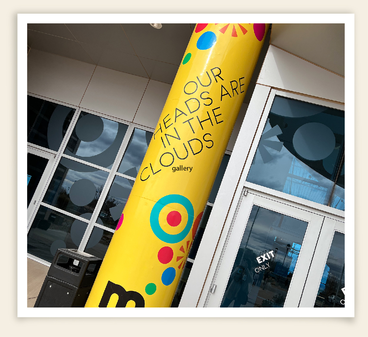
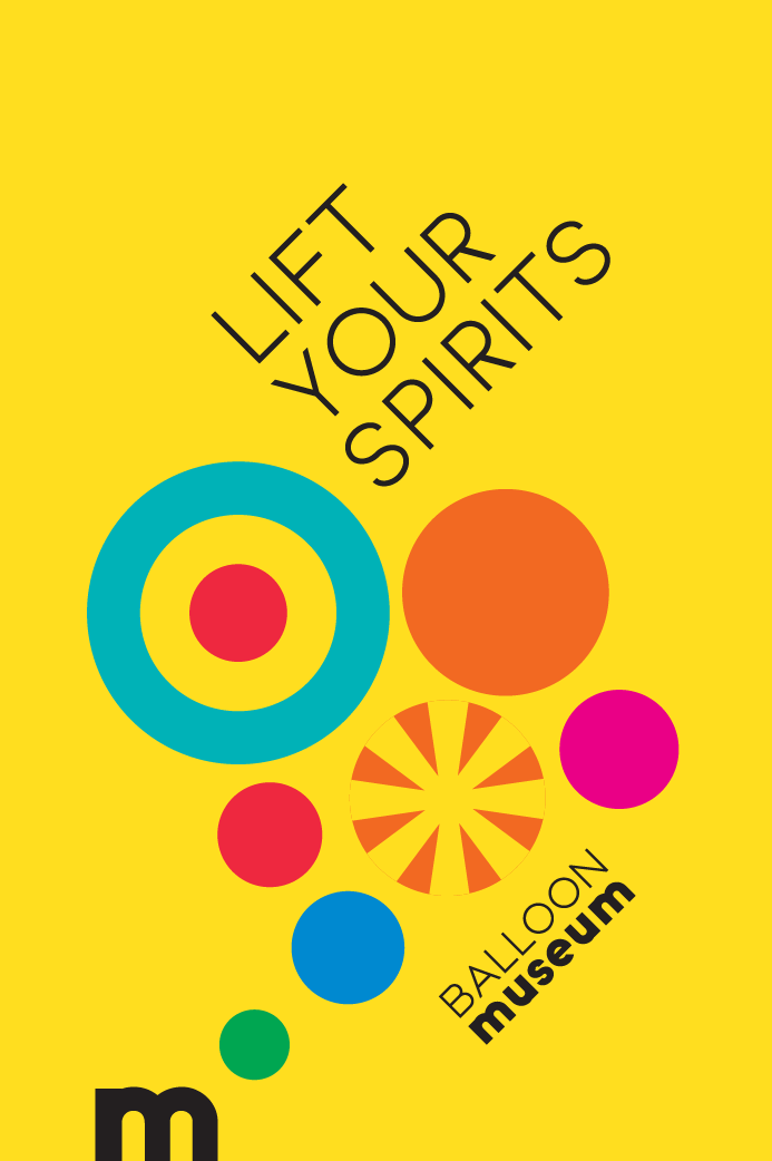
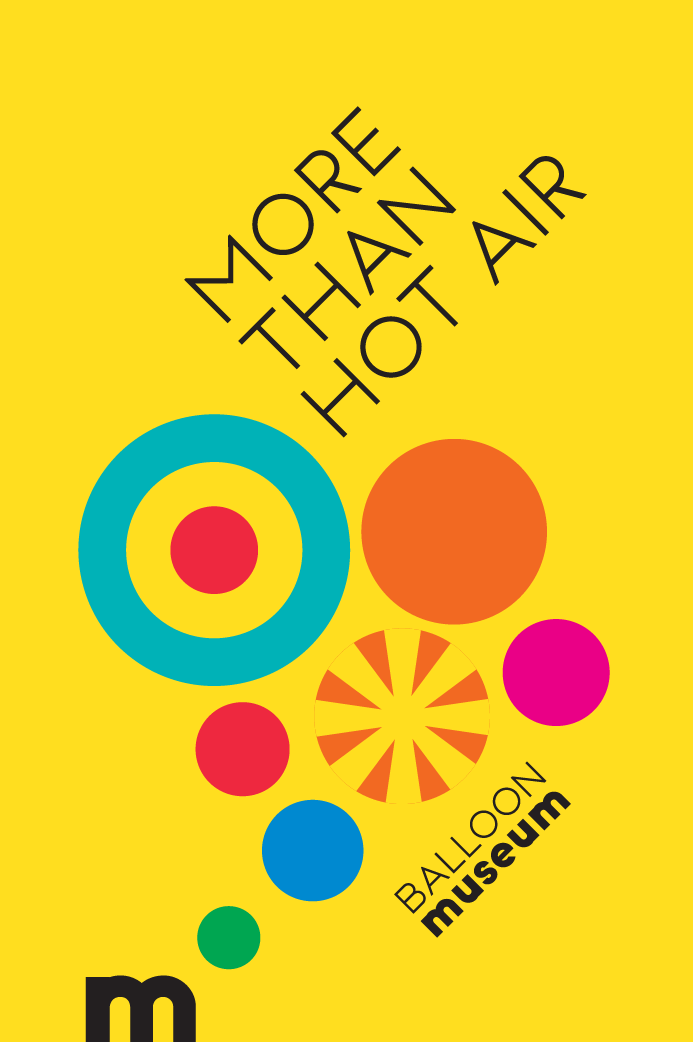
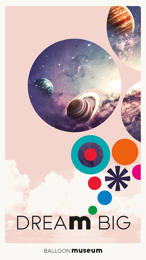
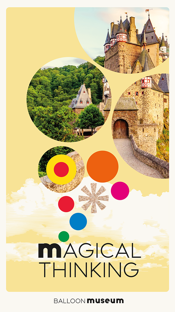
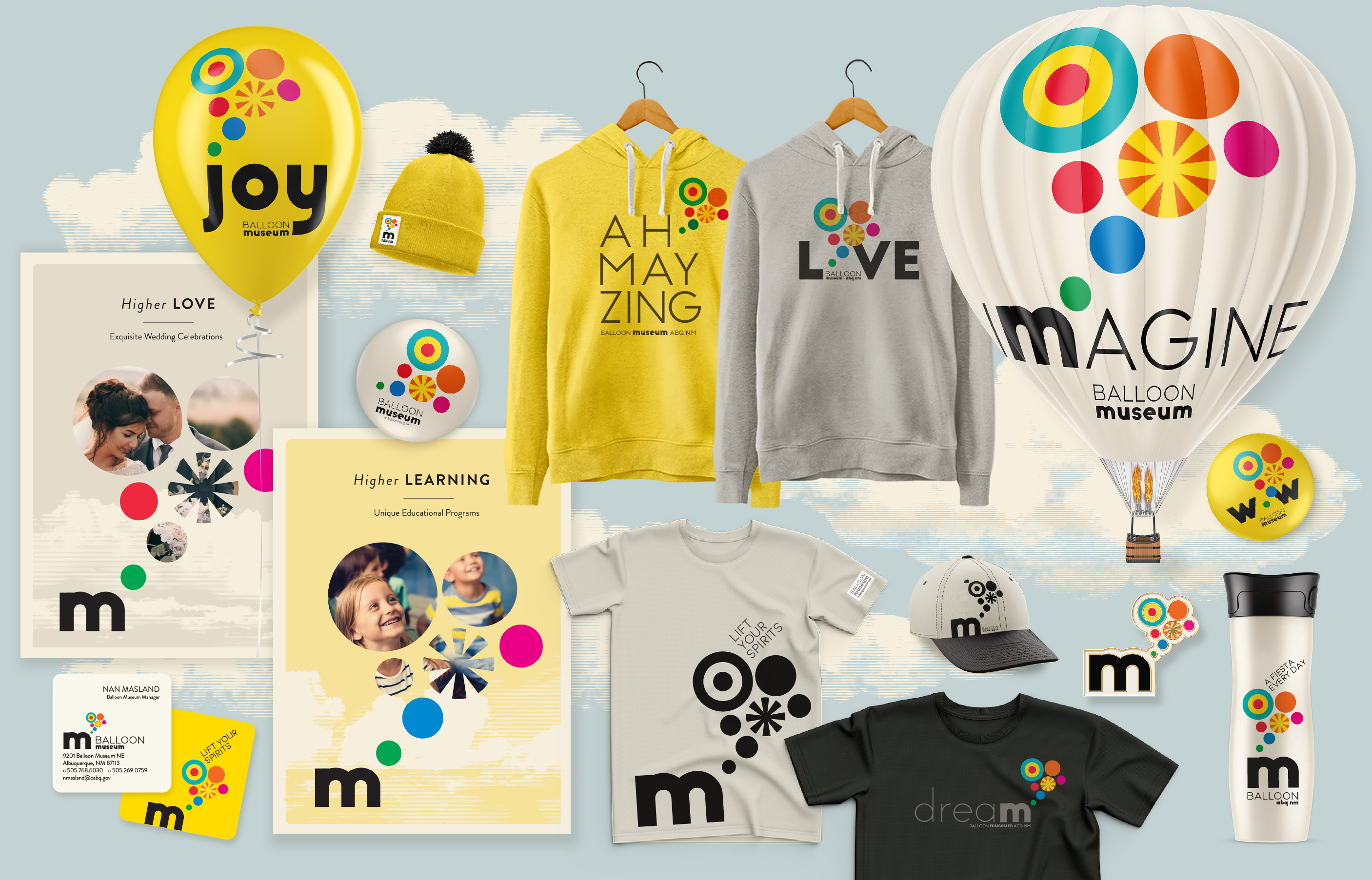
To enhance memorability, we created several brand messaging libraries that feature words containing the letter "m" and integrate the logo, along with amusing phrases that spark curiosity about the museum. These are strategically placed in high-traffic zones and serve as prompts that epitomize the essence of the Balloon Museum - amusement and exploration!
EXHIBITION DESIGN
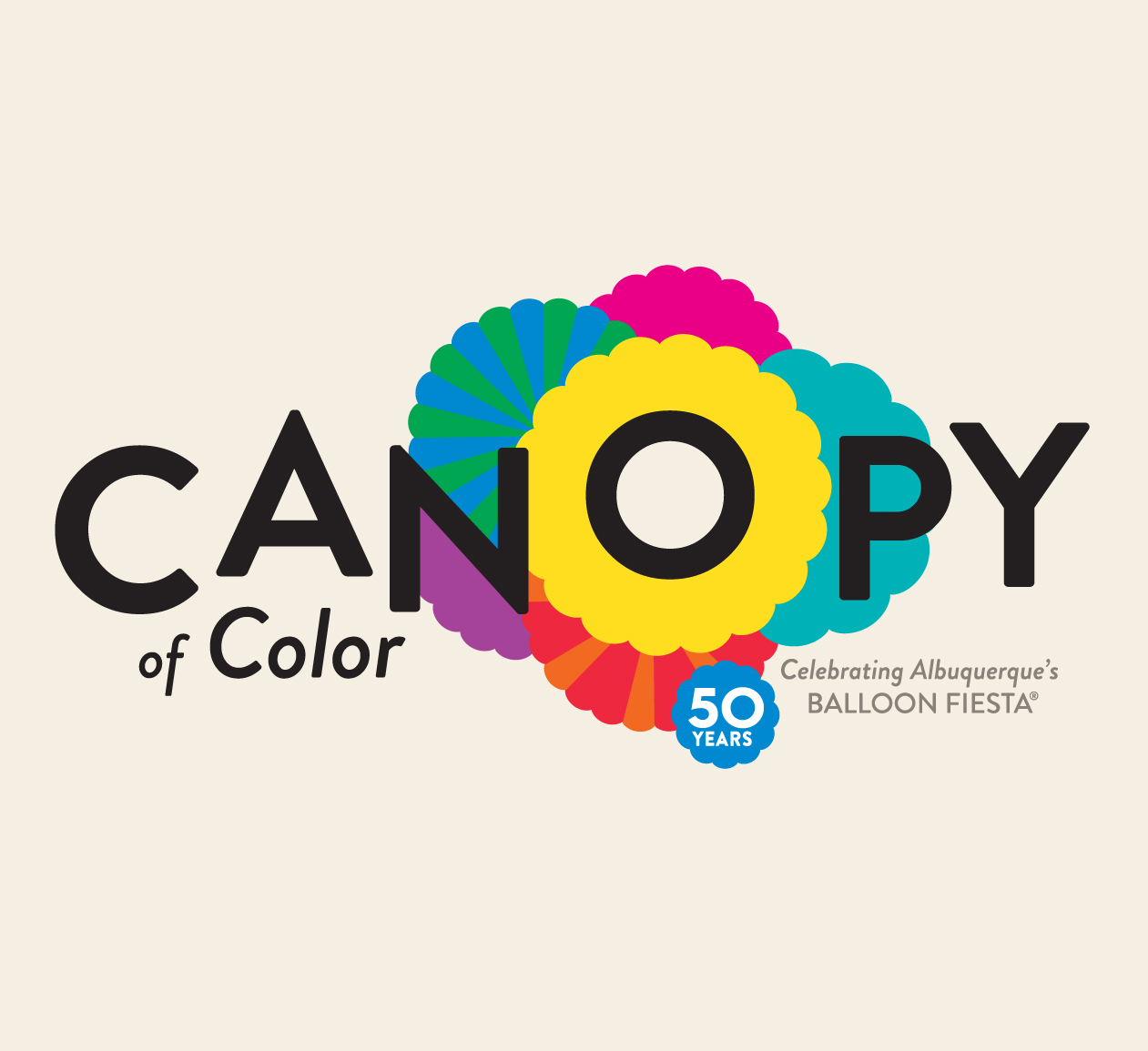
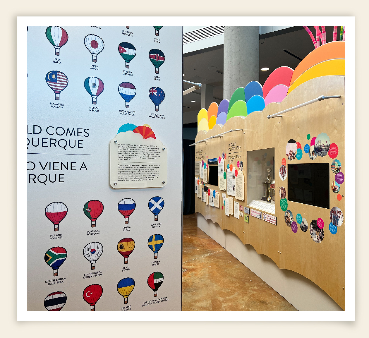
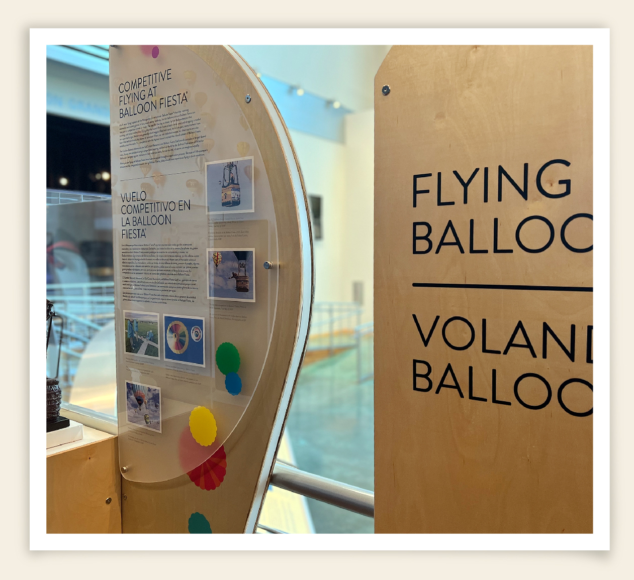
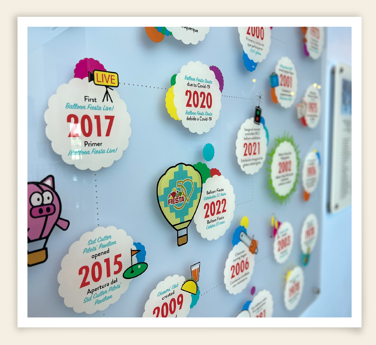
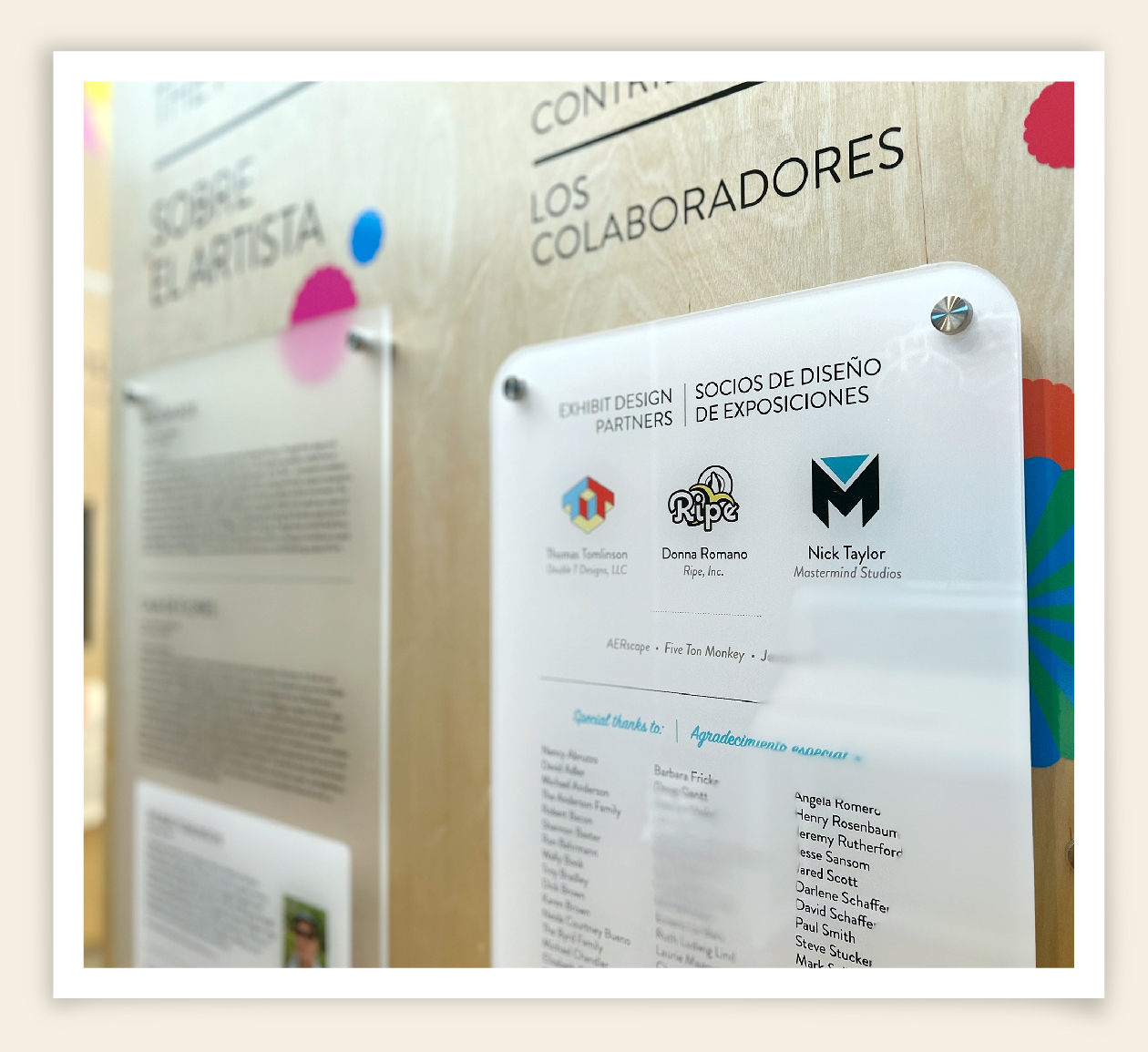
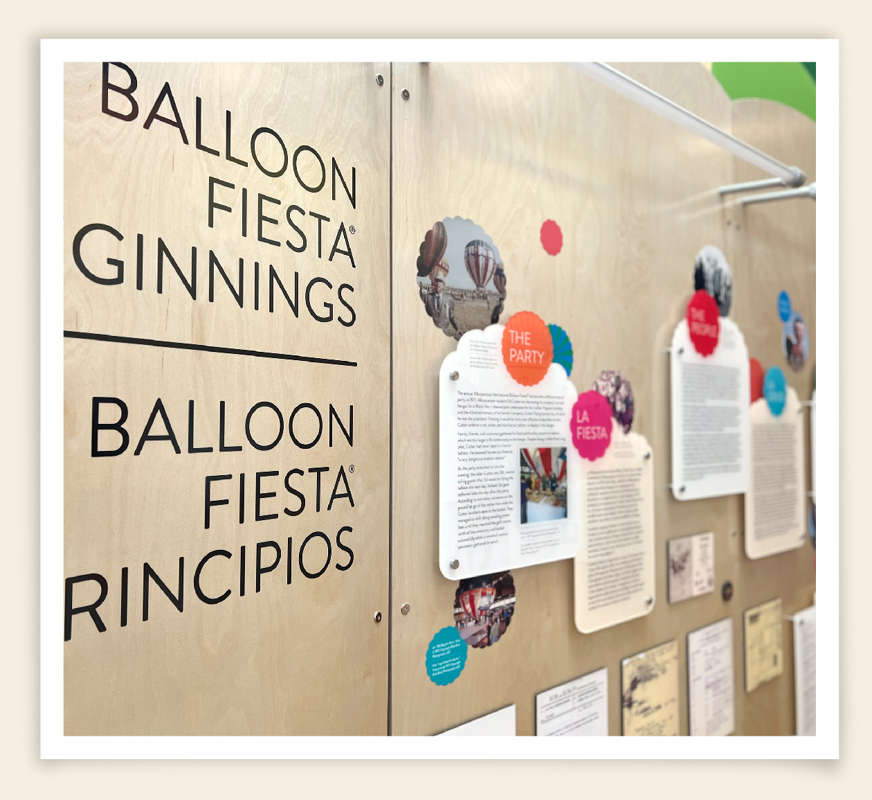
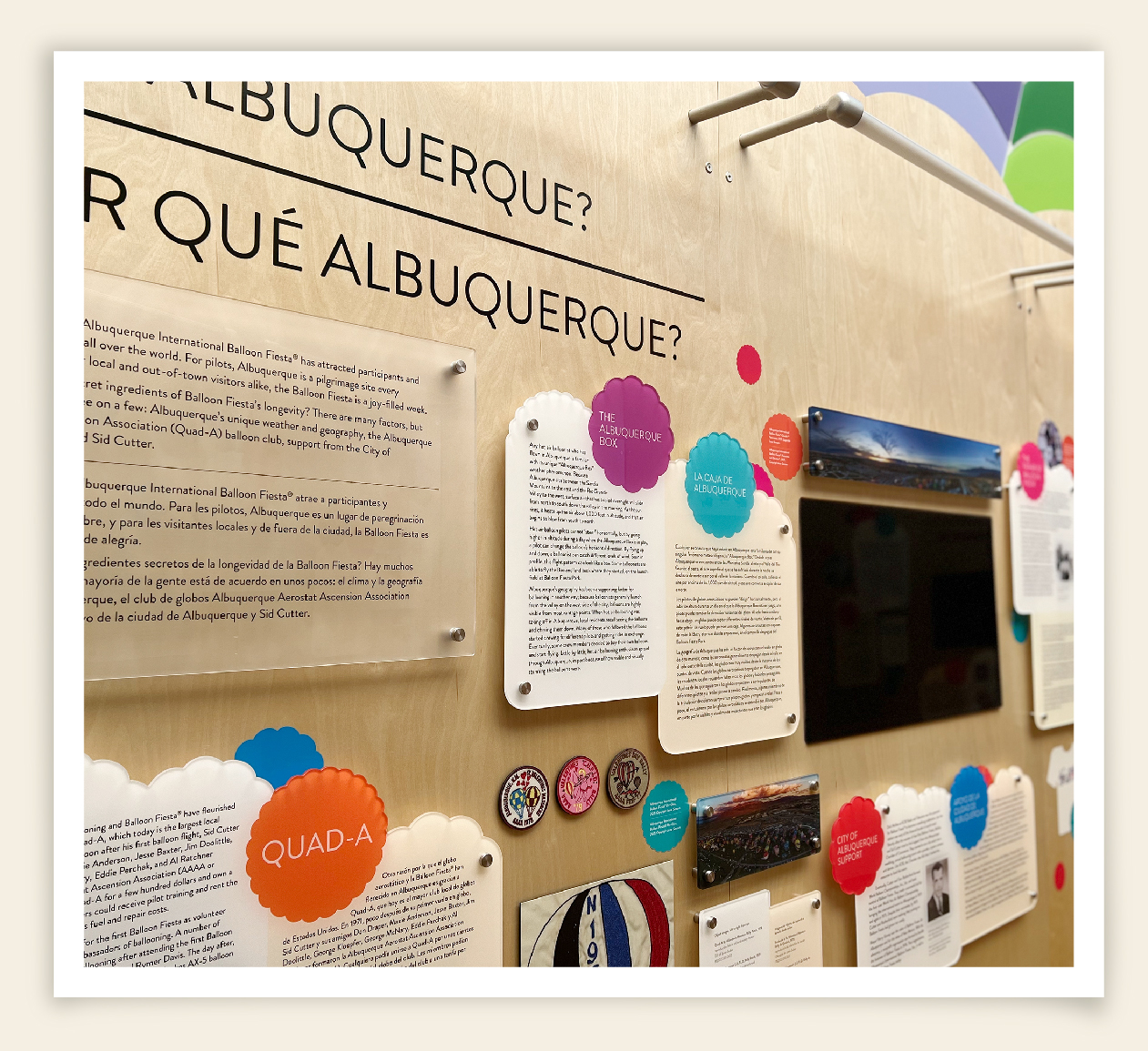
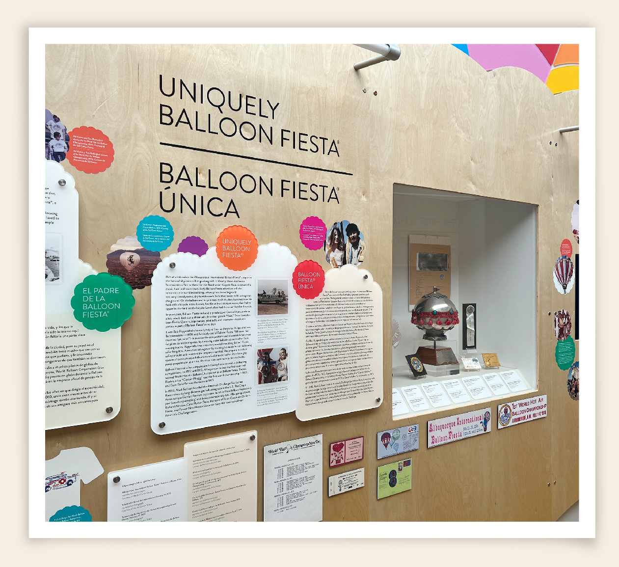
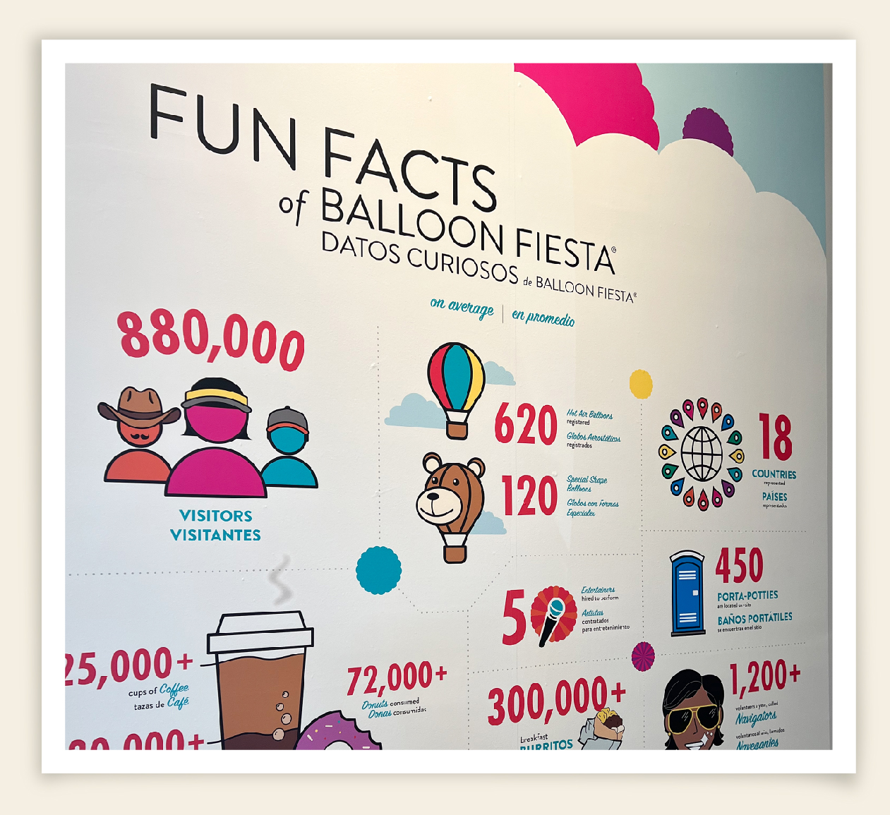
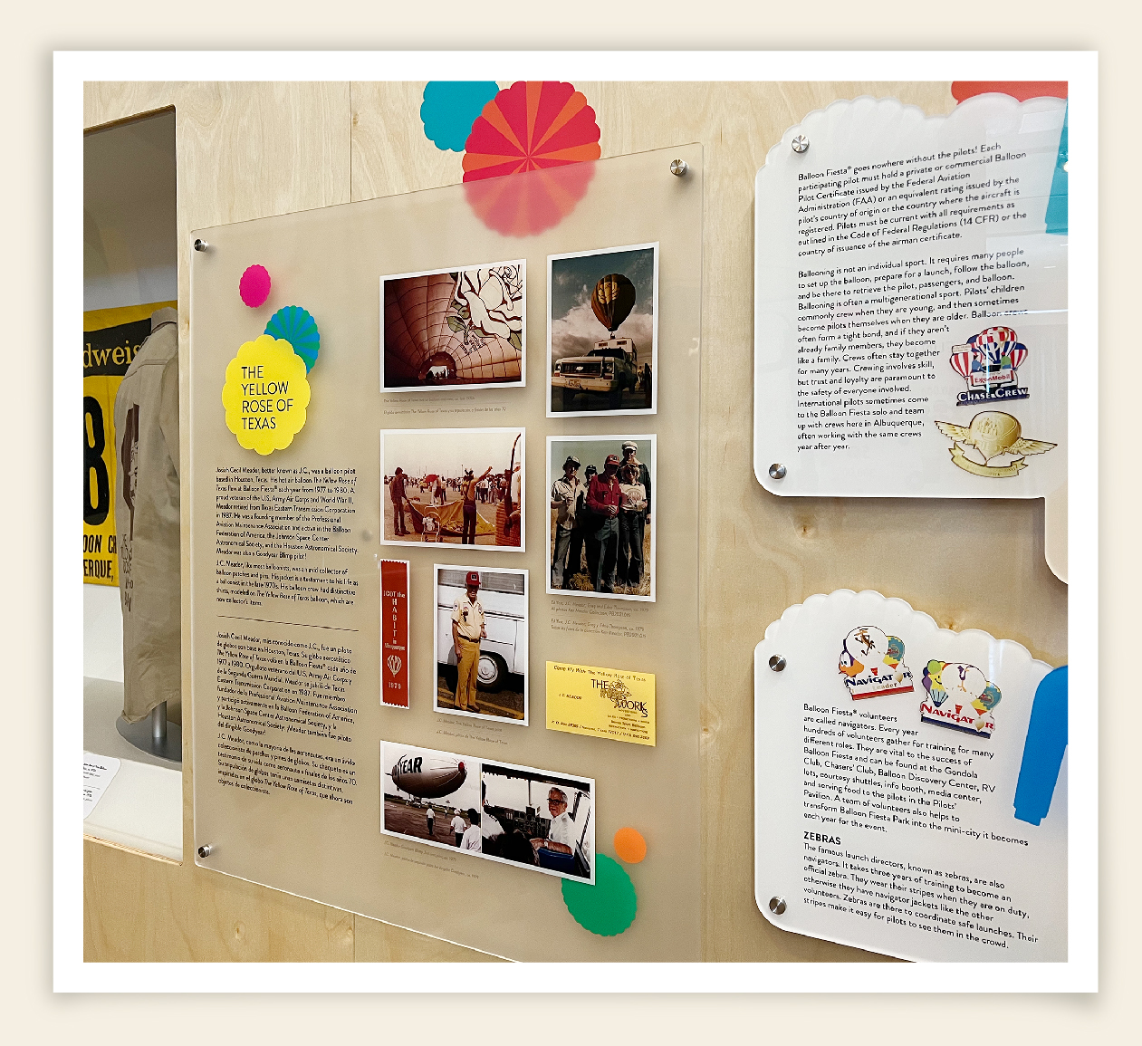
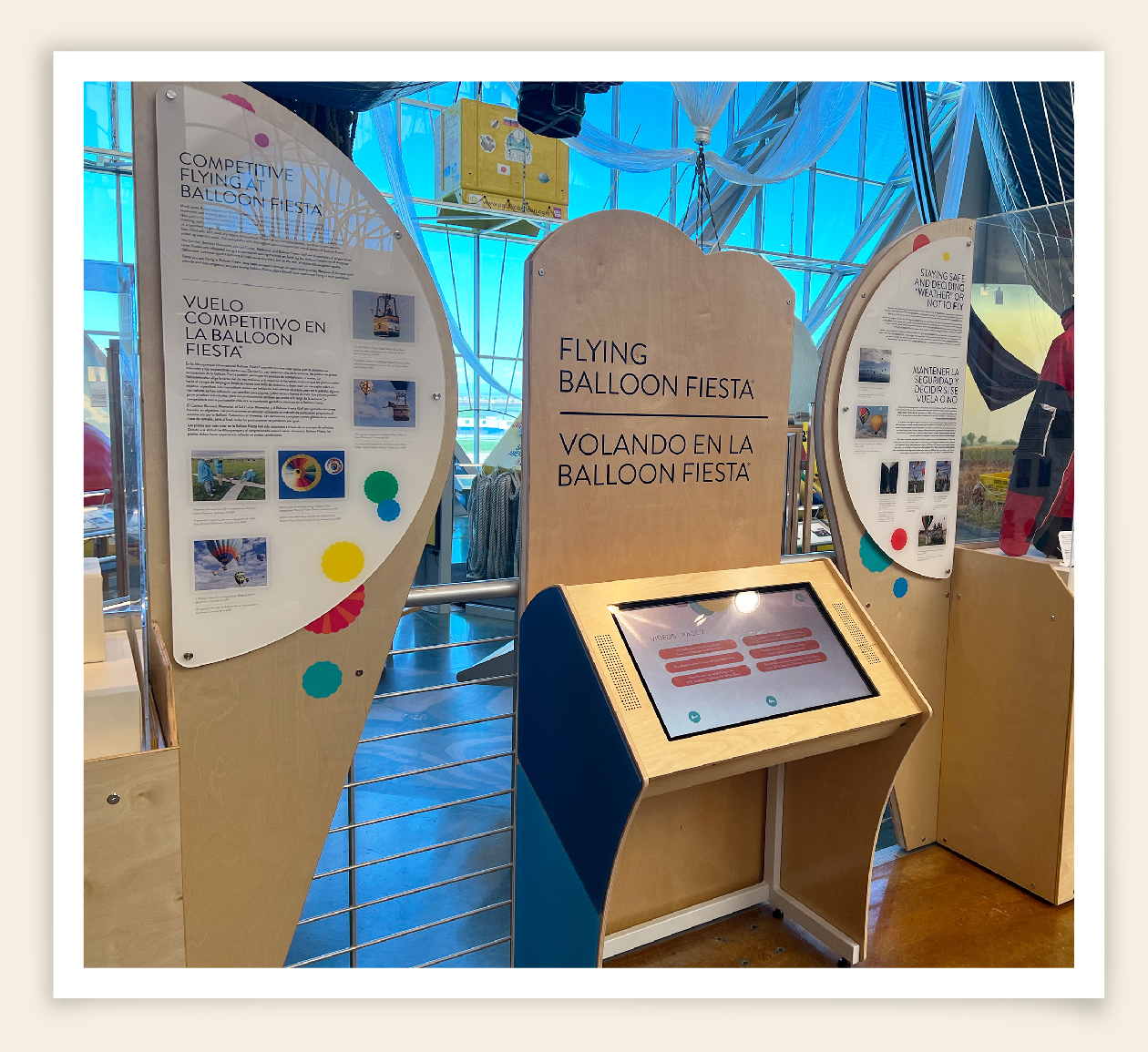
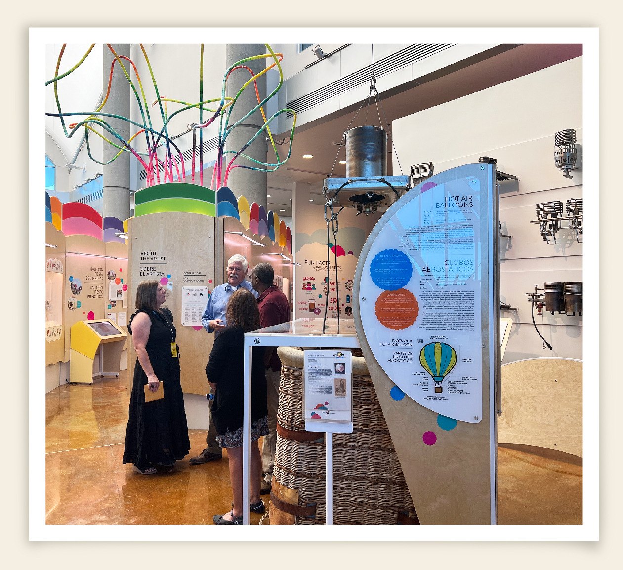
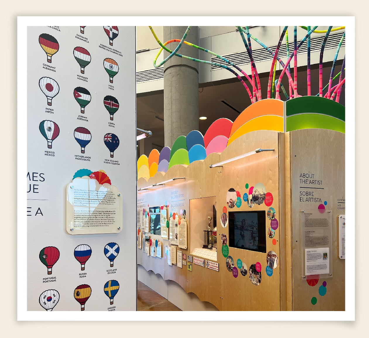
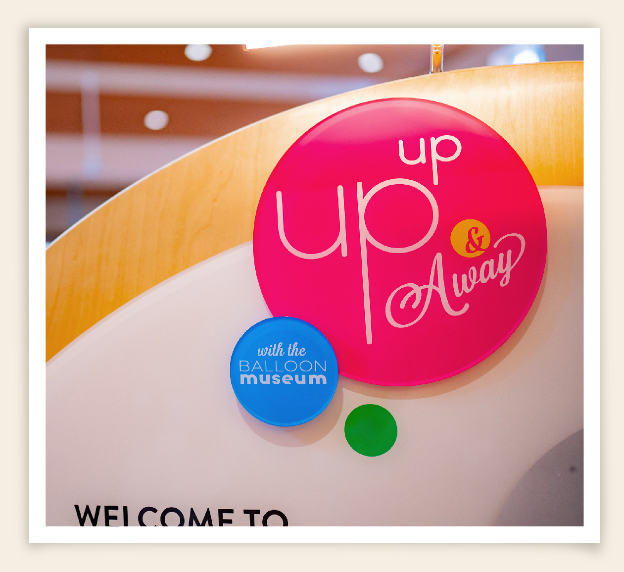
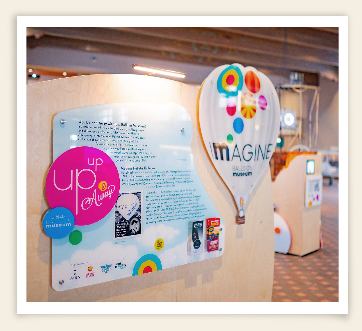
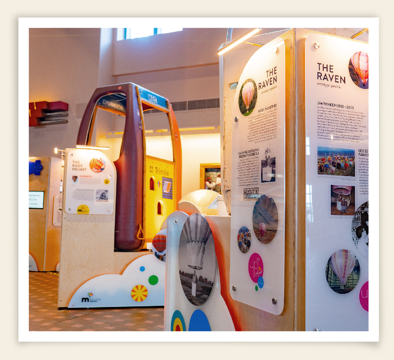
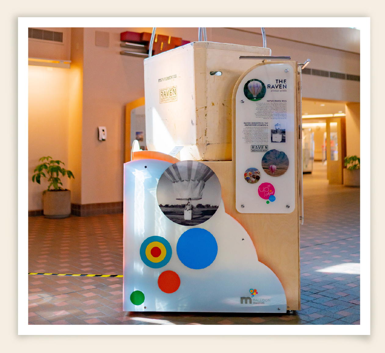
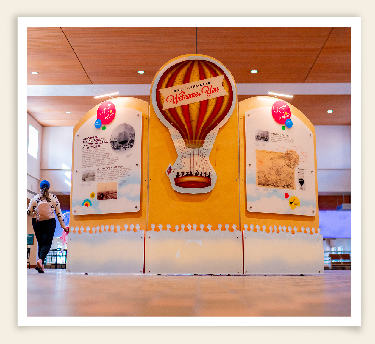
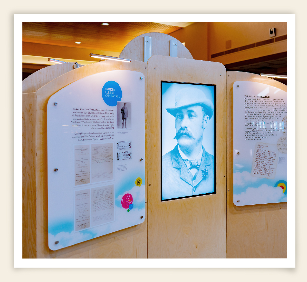
As a member of an innovative team of curators, media designers, exhibit designers/fabricators, and technicians, Ripe contributed to the development of two highly successful public exhibits: Canopy of Color at the museum, and the ABQ Sunport exhibition: Up, Up and Away! These projects demanded intensive collaboration and Ripe was specifically responsible for the exhibit branding, design, and layout of all graphics and content.
“If you’re looking to refresh your brand and image – I highly recommend hiring RIPE, Inc. They took the essence of what we stand for and turned it into a delightful new look and branding system. They surpassed any of my expectations. Donna, Len and the whole team are simply fantastic.”


